
Zeos
Design
System
Create tomorrow's full-stack AI Application experience with World's
first Zero-Code platform

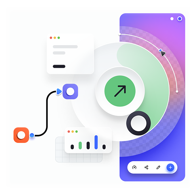
Flexible
Start building immediately with the dashboard libraries that delivers the best possible user experience.
Efficient
Zeos design system saves time and energy. Standardized, component provides a consistent user experience.
Scalable
Extend the apps with the app bundles at scale with the living design system that evolves as needed.
The Color System
Learn about the research and testing that went into creating our color palette with 7 shades for each to ensure versatility, accessibility, consistency and scalability.
Color System

Typography
Keeping typography consistent and sticking to logical hierarchies ensures that elements in the UI are clear and easily recognizable when scanning the page. Text sizes, styles and layouts were selected to balance content and UI and to foster familiarity.
Typography